COVID-19 indicators analysis portal
MODULES AND PLUGINS
PROJECT
We have created a portal for internal use that allows ASL FOGGIA to view and analyze all the information relating to the progress of the Covid-19 epidemic, both from a temporal and geographical point of view.
CUSTOMER

ASL Foggia is one of the main healthcare companies in the Puglia region, it carries out institutional activities throughout the province of Foggia, covering 61 municipalities. The provincial population has reached 606,904 units.
THE NEED
The customer needed to centralize the collection of data related to the evolution of the pandemic and the trend of vaccinations from all its territorial structures, in order to have an always up-to-date picture of the situation and be able to manage resources more effectively.
THE PROJECT
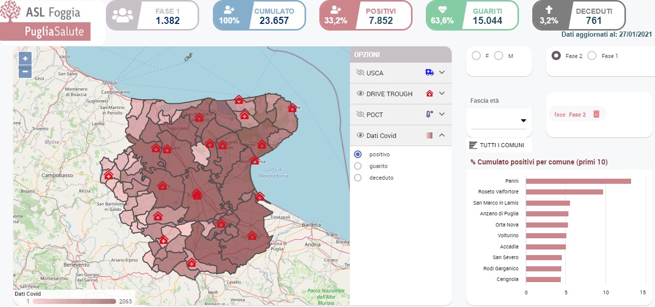
The project started from the development of the process of collecting and daily updating of the data made available by the Istituto Superiore della Sanità (ISS) and usable through the GIAVA VACCINI system of the Asl. Particular attention was paid to the collection of detailed data by gender, age group and risk categories such as health workers, school workers, the police forces or the over 80s. The navigation and analysis of these data were then made possible through the creation of two types of interactive dashboards: those relating to the trend of Covid data (Phase 1 and Phase 2 of the epidemic) and those relating to the administration of vaccines.
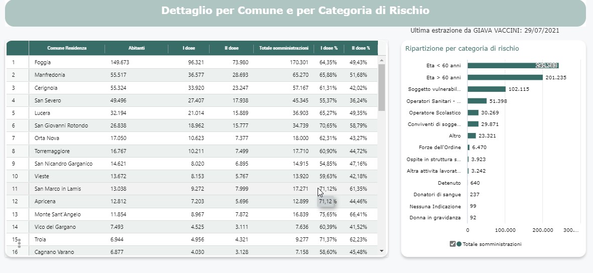
In both types of dashboards it is possible to view the related data geographically distributed on the municipalities of the province of Foggia with the possibility of deepening the analyzes up to the level of detail of the data up to gender and age range, in the case of Covid data, o age group, risk categories, drug and administered dose, in the case of vaccine administrations.
Tabular details and temporal trends complete the information available in a single interactive view.
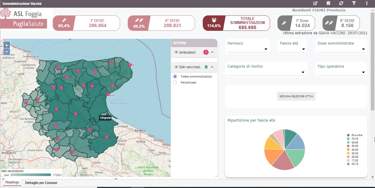
Further examples of information displayed are the summary of the number of positives, healed, deceased, as well as the geographical location of points of interest, such as the facilities used to perform swabs or vaccinations.
Finally, each dashboard corresponds to a relative summary and detail static report that can be easily exported to Excel and shared with other company users.
THE RESULTS
Through the portal, the customer is now able to provide daily updated and useful information on the progress of the covid-19 pandemic and vaccinations to the director of the ASL, his collaborators and all the mayors of the municipalities in the province of Foggia, allowing a truly data-driven political-administrative management.