COVID-19 data visualization and analysis
5 Free interactive dashboards
The 2020 started with a great challenge for Italy and the whole world. The global COVID-19 pandemic heavily challenges our countries in all their sectors, from health to socio-politics and economy. Data collection and presentation has become an even more essential skill for public administrations to effectively communicate with citizens. Citizens, in fact, are worried and eager to clearly understand data around this phenomena without the need of a specific analytics education.
This emergency fastened the already ongoing process of transparency of public data and the sharing of Open Data from public administrations. Different free repositories are available on GitHub, for Italy the reference source is the account of the Italian Civil Protection.
The open source community is playing a strong role in this emergency contributing both with hardware and software to fight COVID-19. As active members of the open source community, KNOWAGE Labs wanted to use their expertise on data visualization and data analysis to make open data about COVID-19 as meaningful as possible for everyone.
Therefore, KNOWAGE Labs developed different interactive dashboards over COVID-19 open data and made them available for everyone on KNOWAGE online demo. These dashboards allow user to look at daily and cumulative data of the chosen measure and to make comparisons between different regions or countries. Moreover, two additional dashboards were realized over Italian Data to allow predictive analysis. The realization of these forecast dashboards has been supported by Engineering Ingegneria Informatica through the contribution of its Excellence Competence Center in Data & Analytics.

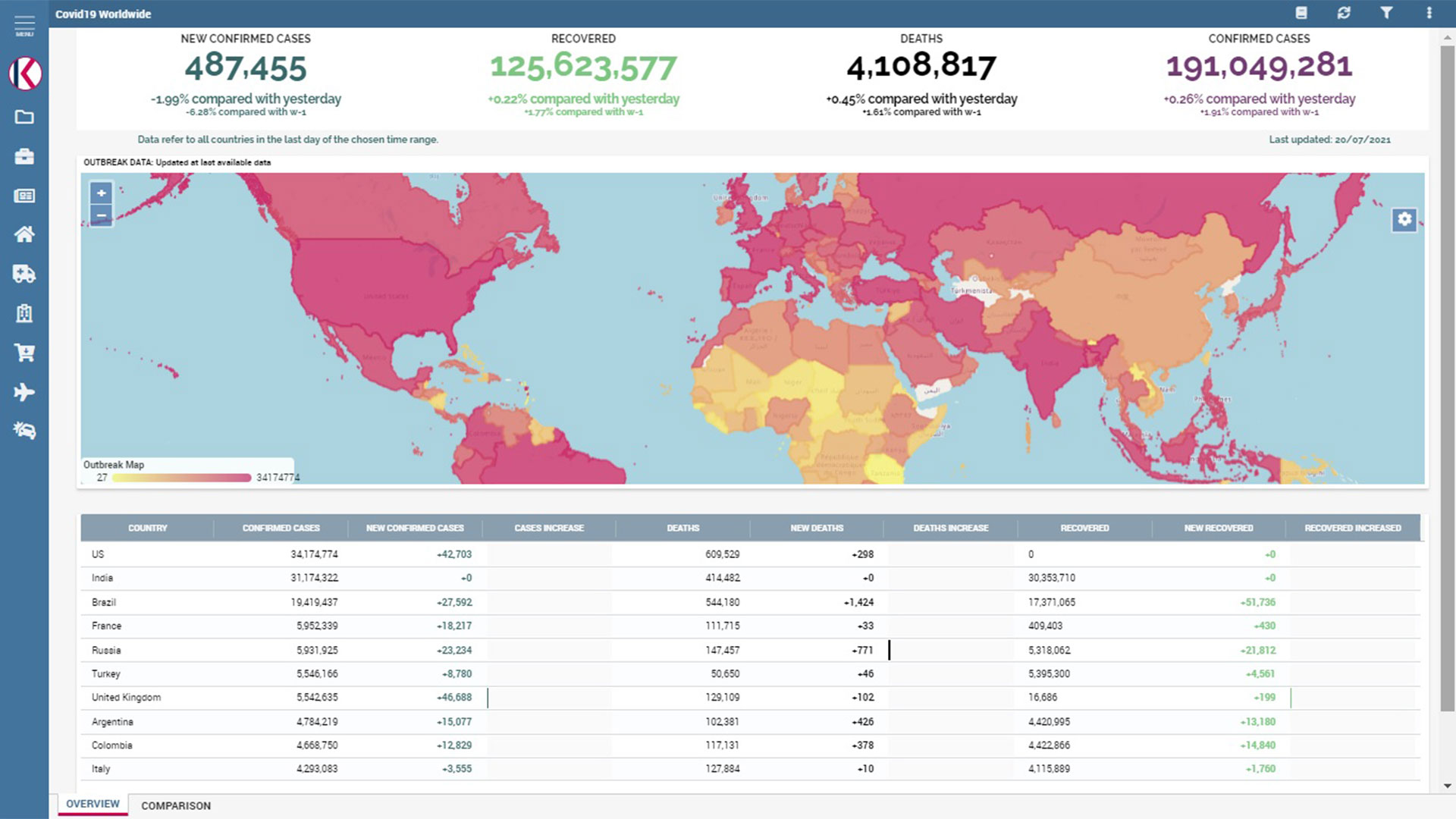
This dashboard allows to have a glimpse on updated new confirmed cases, recovered, deaths and confirmed cases worldwide. An interactive map allows to easily visualize the phenomena according to the chosen measure and a table allows to deepen the analysis looking at detailed data with the percentage increase. Data come from CSSE at Johns Hopkins University and are updated each 24 hours.

This dashboard allows to analyze updated data of different measures filtering them according to a specific time range. A map allows you to visualize the phenomena according to the chosen measure and an interactive chart compares cumulative data of each measure between them. At the bottom of the page, a table allows to look at detailed data with the percentage increase.

This dashboard allows to customize the analysis choosing one or more regions and the time range. Different interactive charts enable the visualization of the data trends according to each measure, the incidence in the population and the state of care of actives. In addition, data trends of each measure can be visualized both daily and cumulatively. Data come from the Italian Civil Protection and are updated each 24 hours.

This dashboard allows to visualize forecast data on total cases and deaths on a chosen day. It is possible to customize the analysis choosing the starting day of the forecast. Two charts visualize both the historical and the forecast trend. At the bottom of the page, a table allows to look at detailed data with the percentage increase for the next 20 days.

This dashboard allows to visualize forecast data on total cases, deaths, positive and healed on a chosen day. It is possible to customize the analysis choosing the region and the starting day of the forecast. Two charts visualize both the historical and the forecast trend. A bar chart allows to evaluate the estimation of the non-identified cases. A table allows to look at detailed data for the next 20 days.